
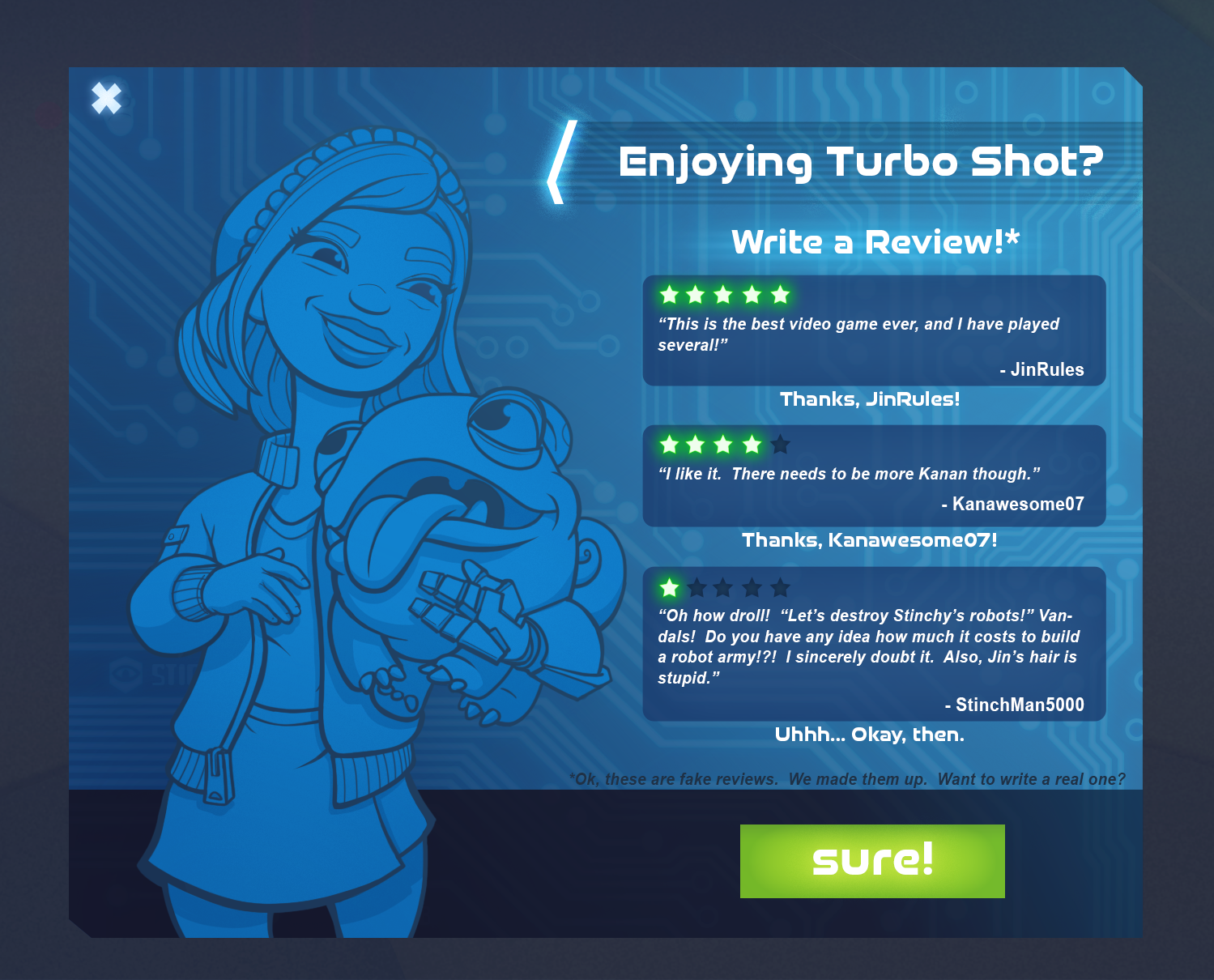
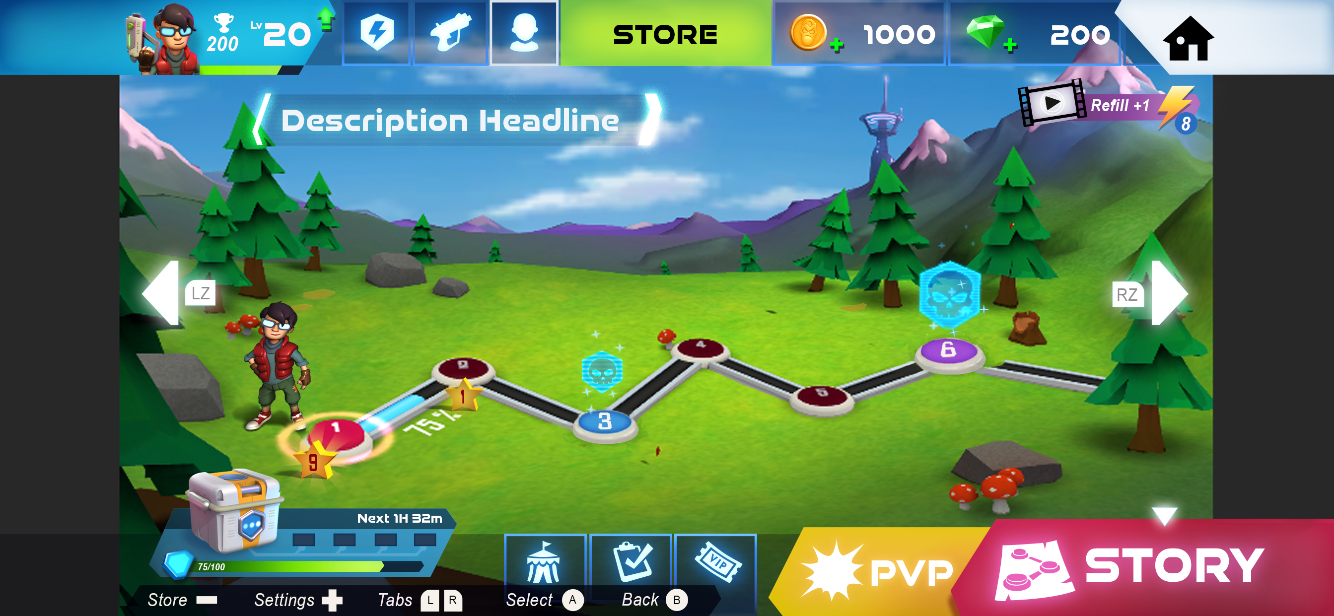
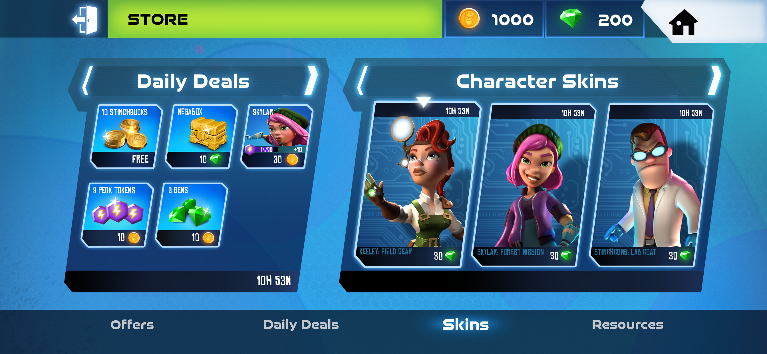
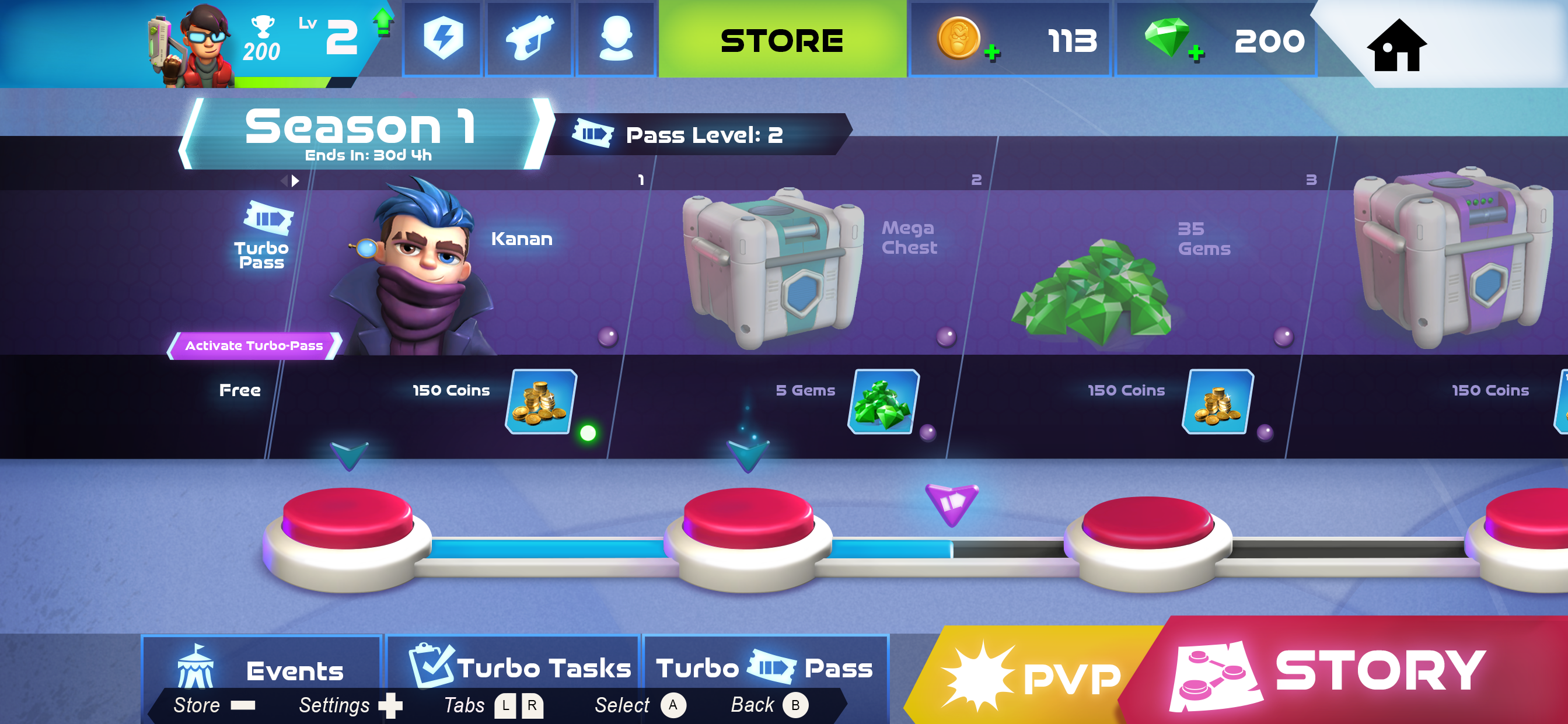
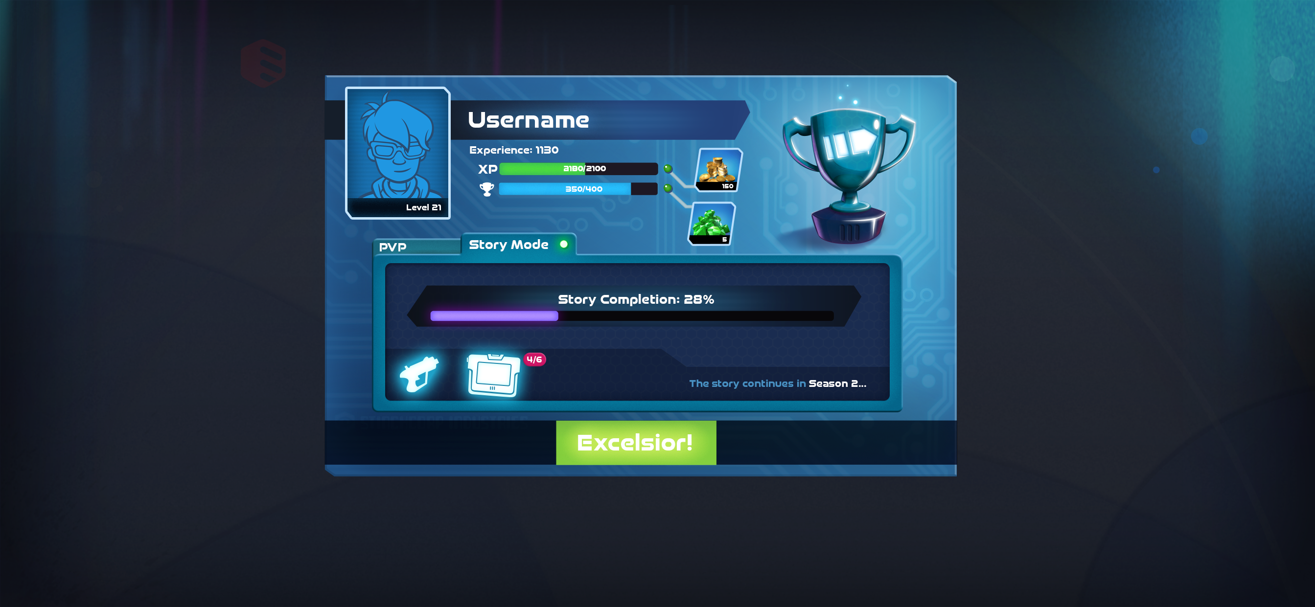
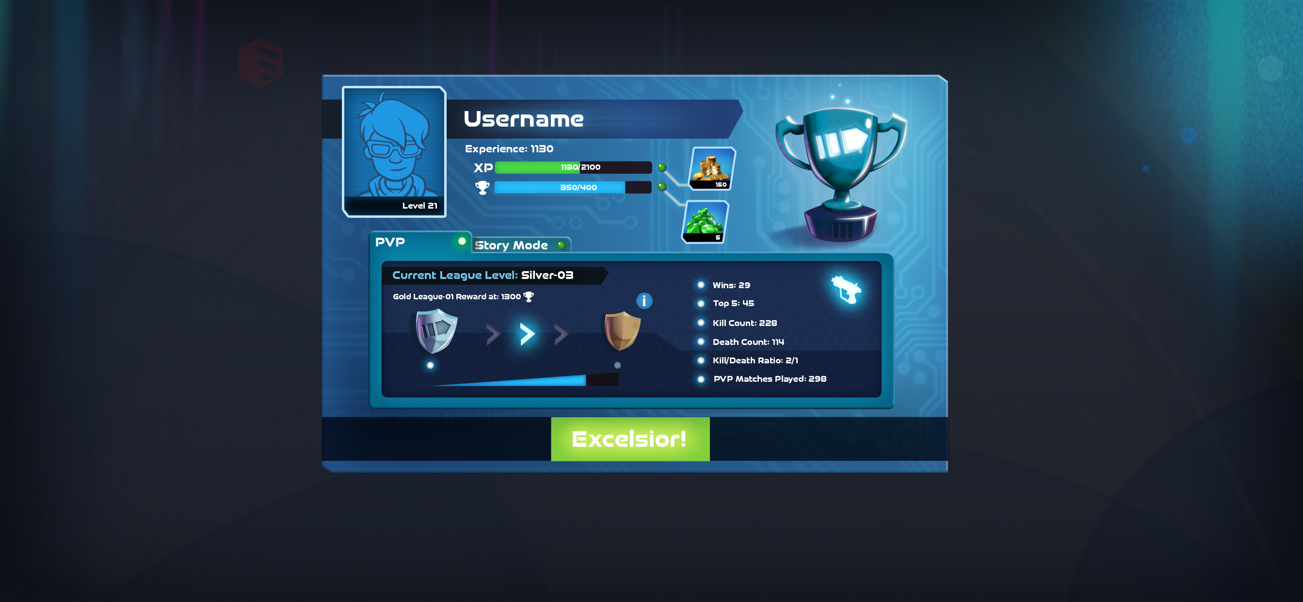
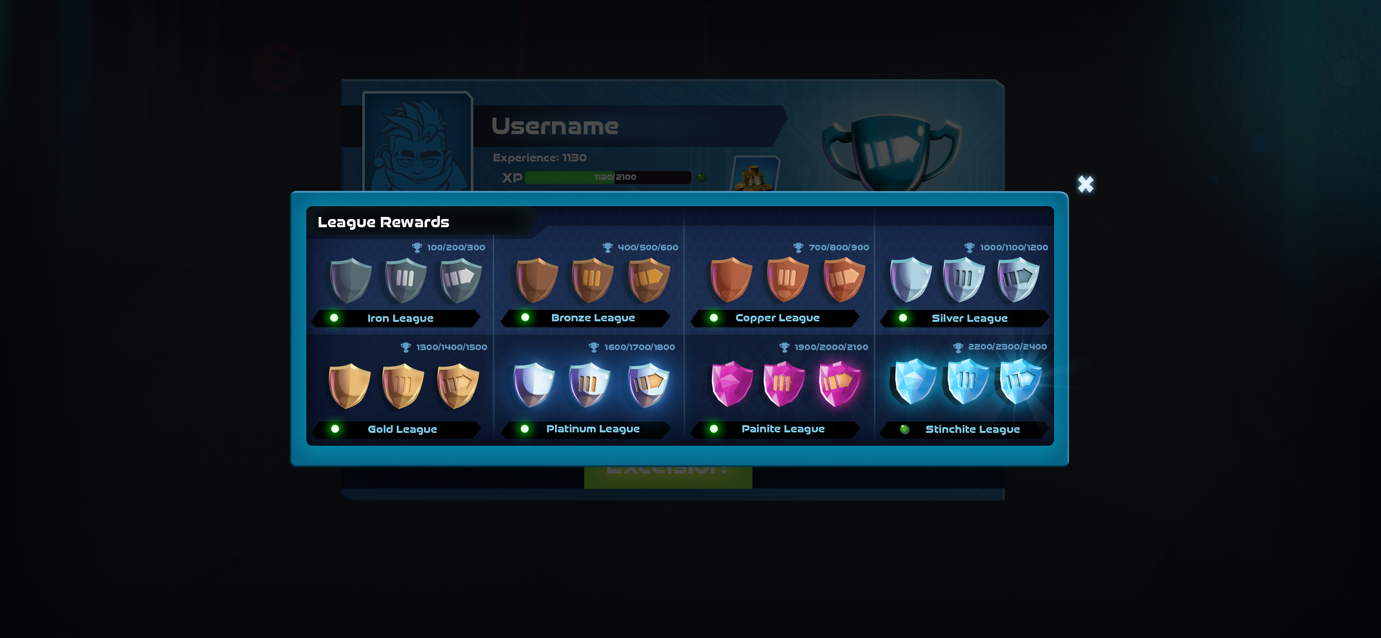
For the UI design in Turbo Shot the idea was to create variations on the main theme. The home screen and store pages are the most colourful, high-key scenes, but as you get into more of the guts of the machine the themes get a little darker. The idea I had in mind was the way areas are laid out on a ship where the main passenger deck and gift shop are the most inviting and pleasant areas, but things are quite different in the engine room, for example.
As with the mechanical designs for Turbo Shot, the idea was that the content was coming from Stinchcomb, who might try to project an appealing facade, but things get darker as you peel back the layers.

A gallery of Abstract backgrounds from User Interface Screens
For this gallery I have stripped out all the interface elements to give you a look at what some of the screen backgrounds look like on their own.


